Line Charts
Line charts are useful for displaying how data changes over time, where the Y axis of a line chart displays the count of an item, and the X axis is a timeline.
To create a line chart, you need to use a query that provides more than one data point in the Aggregates tab, see aggregate operators for details. Then the line is drawn between the data points to show the change.
For example, you'd use the following query to create a Line chart:
error | timeslice 1m | count by _timeslice
which would produce results such as: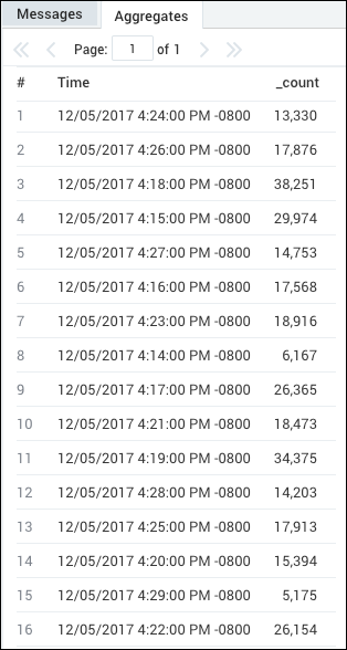
Create a line chart
To add a panel with a line:
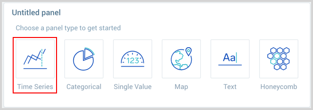
- Create or open a Dashboard and click on Add Panel > Time Series.
- Provide a Metric or Log query and press Enter for it to run.
- Once the query runs, ensure the chart type is set to Line.
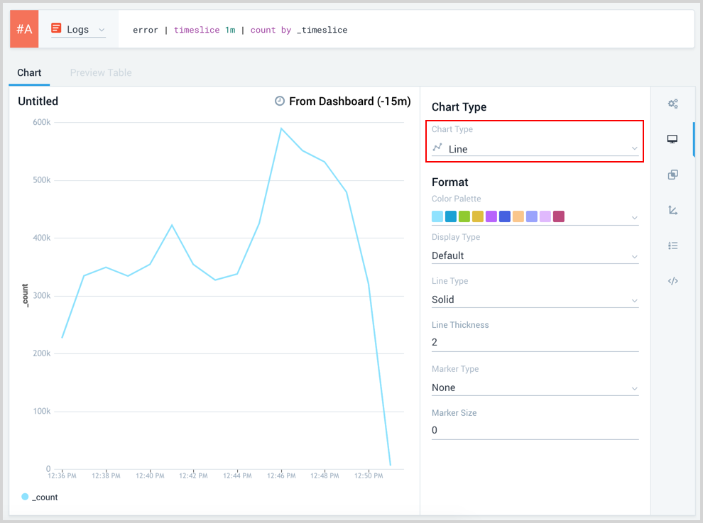
- Modify the chart as desired.
- Click the Add to Dashboard button on the top right of the window to add the panel to your dashboard.