Modify a Chart
You can customize a chart on a dashboard panel in a variety of ways by modifying the available settings. You can even change the chart type to analyze the data in another format. This page shows you how to edit a panel and customize General, Display, Display Overrides, Axes, Legend, and JSON chart settings.
Settings can change vary according to the chart type.
Begin the customization process by selecting the dashboard panel with the chart you wish to modify.
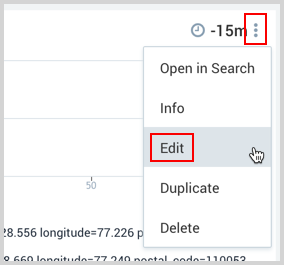
To edit a panel, do the following:
- On the chart panel, click the kebab icon.
- Select Edit from the dropdown list.
The Chart page appears with the panel settings menu bar on the far right. The Display options are shown by default.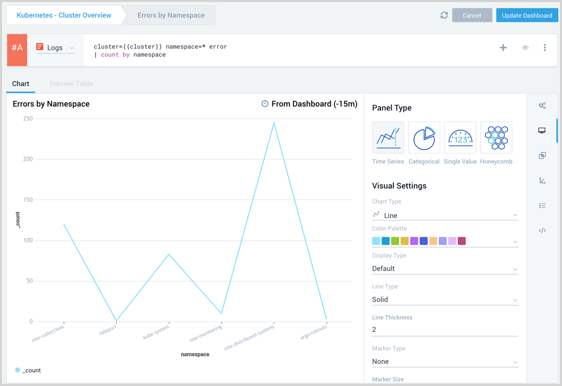
Modify the panel query
You can modify the panel query based on the requirement to customize the chart. While editing the panel you can view the applied dashboard variables and also edit the values to see how they affect the panel query.
Once you have adjusted the values as needed, make sure to re-run the panel query to apply the modified variables.
Any changes made to the variable values within the panel will only affect the current editing session and will not be saved to the dashboard once you finish editing the panel.
Modify general settings
To modify general settings click the General icon in the menu bar.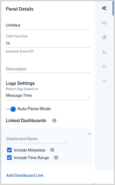
- To change the name of the chart, click in the Chart Title field and enter a new name.
- To change the font size click the Title Font Size arrows up or down.
- To add a helpful description, click in the Description field and enter a brief explanation of the chart's purpose.
To save your settings and return to the dashboard, click Update Dashboard in the upper right corner of the window.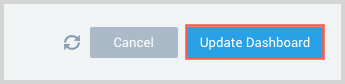
Logs Settings
You have the option to use the receipt timeor the default message time.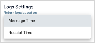
You can toggle Auto Parse Mode.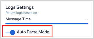
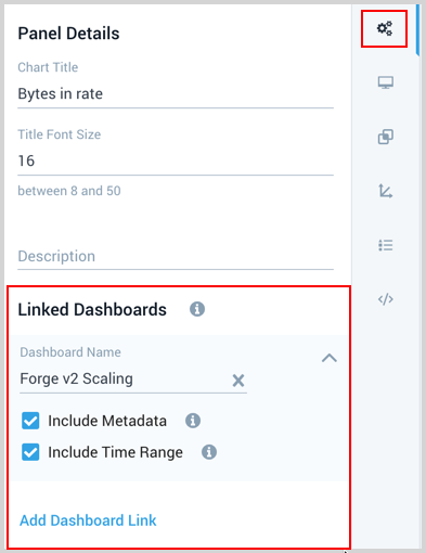
Link dashboards
You can configure links to other dashboards on a panel. When you select a data point on the panel you will have an option to click on linked dashboards. This allows you to quickly reference other related dashboards to investigate.
- Click the Add Dashboard Link from the bottom of the general settings menu.
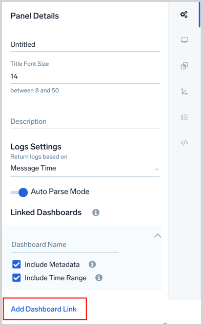
- Click in the Dashboard Name input area and select or enter the name of the dashboard you want the panel to link to.
- Select to Include Metadata if you want the linked dashboard to run against the metadata and variable values of this panel.
- Select to Include Time Range if you want the linked dashboard to run with the time range of this panel.
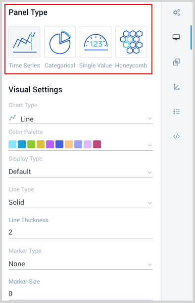
Modify display settings
The customizable display settings vary according to the panel and chart type. In our example, we are modifying a time series chart.
To customize the visual display of a chart, do the following:
- Click the Display icon in the menu bar.
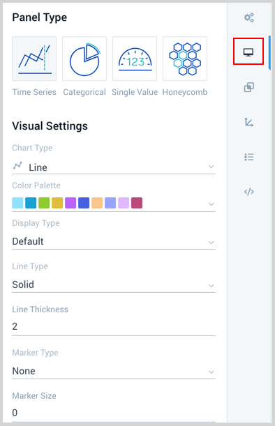
- You can change the Panel Type by selecting another type icon.
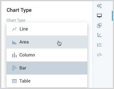
- To change the format of the chart click Chart Type and make a selection from the dropdown list.
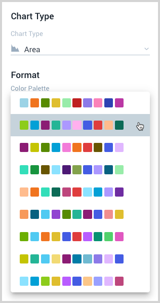
- To change the colors of the chart display click Color Palette and make a selection from the dropdown list.
- Make selections for the other format options available for the chart type.
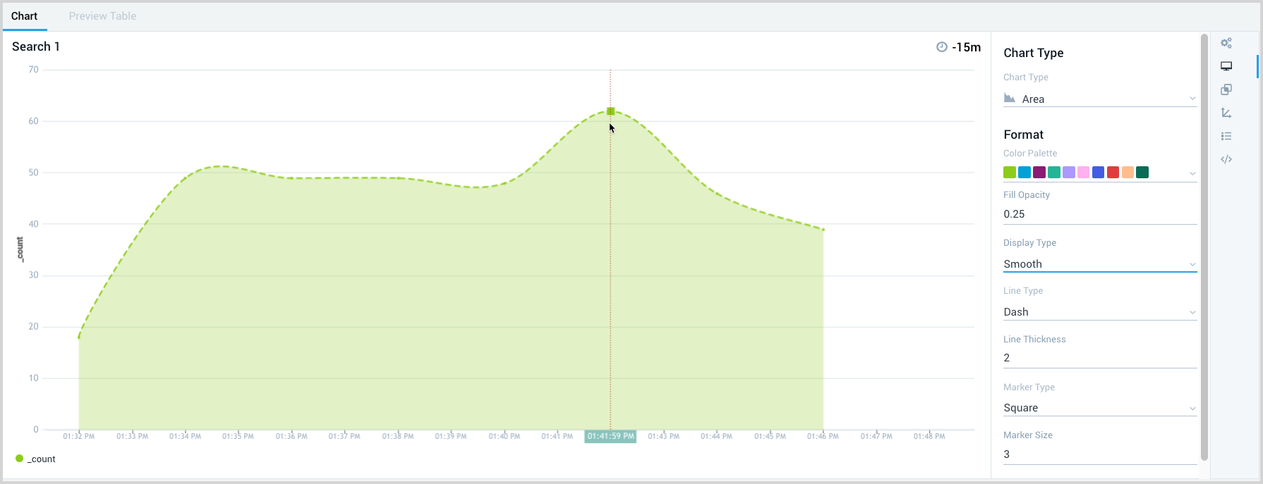
- To save your customized settings and return to the dashboard, click Update Dashboard in the upper right corner of the window.
Group by setting
Honeycomb charts and categorical column and bar charts from metrics queries have a Group By setting. Use the Group By setting to group the data shown in your chart by a dimension already displayed in the output data.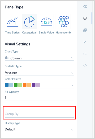
Override dashboard displays
The ability to override dashboard displays allows you to create panel visualizations that make charts easier to assess and form conclusions. You can override selected dashboard displays to create a visual story that highlights what is most important to monitor.
For example, you may want to set a specific time-series to red to signify that it represents errors, or overlay two different metrics with different axis ranges so it is easy to correlate across them. You may also want to rename the legend and tooltip values of a chart for readability and ease of use.
To override select dashboard displays, do the following:
- Click the Display Overrides icon in the far right menu bar.
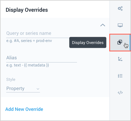
- Enter a Query or series name you want to override. This is the letter of the row the query is assigned to, for example #A and #B. The following image shows a metrics and logs query charted together. In the Display Overrides menu the Logs query is referenced as #B to assign an alias and red color.
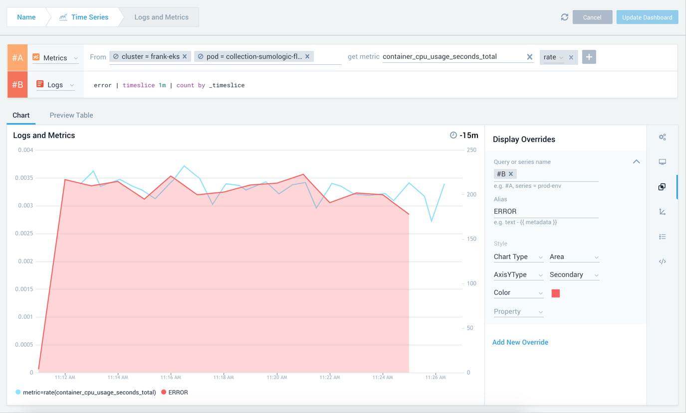
- Enter an Alias, as necessary. Metrics monitors allow you to specify output metadata as a variable wrapped in double curly brackets,
{{ }}. For example, if my output metrics hasenvironment, I can specify it in my alias as{{ metric }} on {{ deployment }}.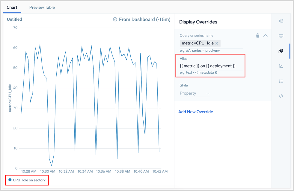
- Select a Property from the dropdown list. You can add as many properties and needed.
- Optionally, add another override by selecting Add New Override and completing steps 2 - 4.
- To save your customized settings and return to the dashboard, click Update Dashboard in the upper right corner of the window.
Modify chart axes
You can easily change the displays of the X and Y axes.
To change chart axes displays, do the following:
-
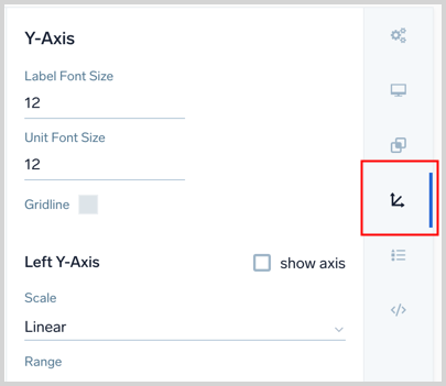
Click the Axes icon in the far right menu bar.
-
For the Y-Axis, you have the standard Left Y-Axis as well as options for a second Right Y-Axis. The Y-Axis starts with the following main options:
- Label Font Size. Size of the label font
- Unit Font Size. Size of the unit font
- Gridline. Color for the gridline
The Left Y-Axis is the secondary axis created from your query. It is displayed by default.
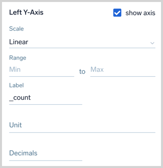
Enter or modify the following options, as necessary:
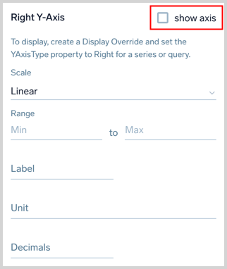
- Scale. Options vary according to chart type
- Range. Range of data for the axis
- Label. The name applied to the data.
- Unit. How the data measurement is expressed. You have variousunits of measurements to select from.
- Decimals. Sets the precision of units displayed. Select the number of decimals to show with a unit, up to 9.
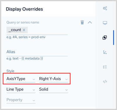
The Right Y-Axis has the same options as the Left Y-Axis. If you have created a Display Override and set the YAxisType property to Right Y-Axis for a query you will have the option to modify the Right Y-Axis here.
To display the right Y-axis you need to select the show axis checkbox.
-
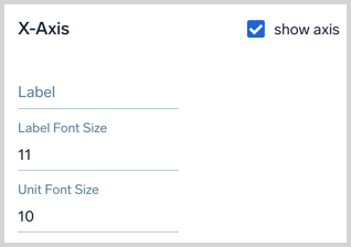
For the X-Axis, you have the following options:
- Label. The name applied to the data.
- Label Font Size. Size of the label font.
- Unit Font Size. Size of the unit font.
-
To save your customized settings and return to the dashboard, click Update Dashboard in the upper right corner of the window.
Modify chart legend
You can toggle the chart Legend display on and off, where it appears, as well as modifying the legend display properties.
To modify the chart legend, do the following:
- Click the Legend icon in the far right menu bar.
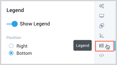
- To turn OFF the legend display, toggle Show Legend to the Left. To turn the legend display back ON, toggle Show Legend to the Right.
- Specify the Position of the Legend by clicking Right or Bottom.
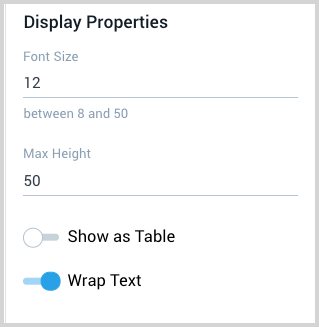
- Modify the following Display Properties, as needed:
- Font Size. Size of the legend font.
- Max Height. Maximum height of the legend.
- Show as Table. Table display, toggle On or Off.
- Wrap Text. Text display, toggle On or Off.
- To save your customized settings and return to the dashboard, click Update Dashboard in the upper right corner of the window.
Modify chart JSON
The JSON for each chart is available for you to customize the visual settings beyond the options Sumo Logic provides in the user interface. You can add settings from canvasJS to the visualSettings section of the JSON.
Changes made to chart JSON are not supported by Sumo Logic and are done at your own risk.
To leverage custom canvasJS properties on a specific series add a unsafeCanvasJSProperties block to any display override block.
To modify the JSON of a chart, do the following:
- Click Update Dashboard in the upper right corner of the window to save your chart customizations.
- Click the JSON icon in the menu bar.
- Modify the JSON as necessary.
- Click Update Preview or Copy To Clipboard.
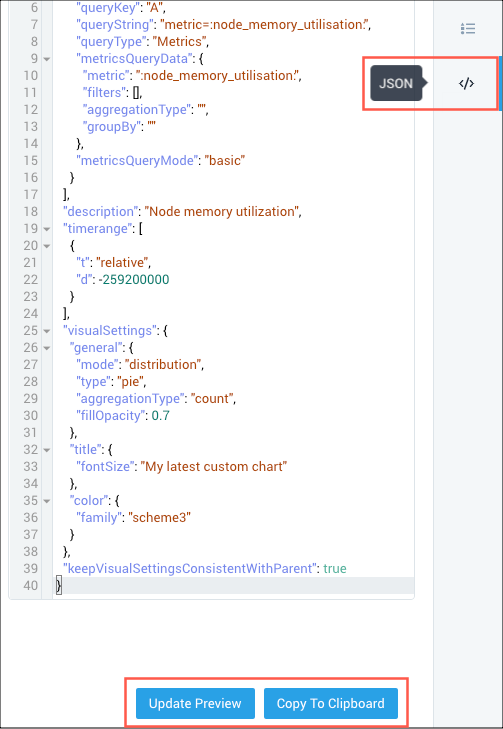
- To save your customized settings and return to the dashboard, click Update Dashboard in the upper right corner of the window.
Values in chart
To view values inside the chart so you do not have to hover on the chart: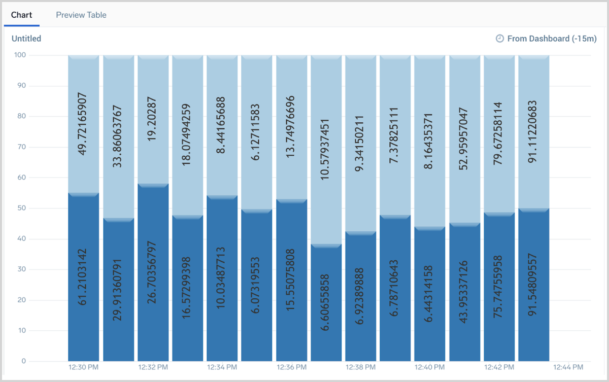
use the following JSON:
"overrides": [
    {
    "series": [],
    "queries": [
        "A"
        ],
    "userProvidedChartType": false,
    "properties": {
        "type": "column"
        },
    "unsafeCanvasJSProperties": {
        "bevelEnabled": true,
        "indexLabelPlacement": "inside",
        "indexLabel": "{y}",
        "indexLabelOrientation": "vertical"
        }
    }
]
Marker visibility
To enhance markers in a time series: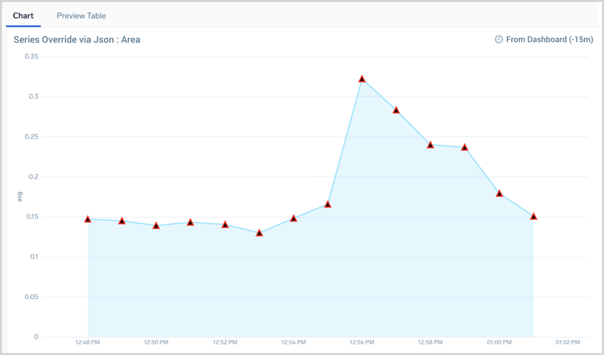
use the following JSON:
"overrides": [
    {
        "series": [],
        "queries": [
            "A"
            ],
        "userProvidedChartType": false,
        "properties": {
            "type": "area",
            "name": "area"
            },
        "unsafeCanvasJSProperties": {
            "markerType": "triangle",
            "markerColor": "black",
            "markerBorderColor": "red",
            "markerSize": 10,
            "markerBorderThickness": 2
            }
        }
]
Outside values
To place values outside the chart so you do not have to hover on the chart: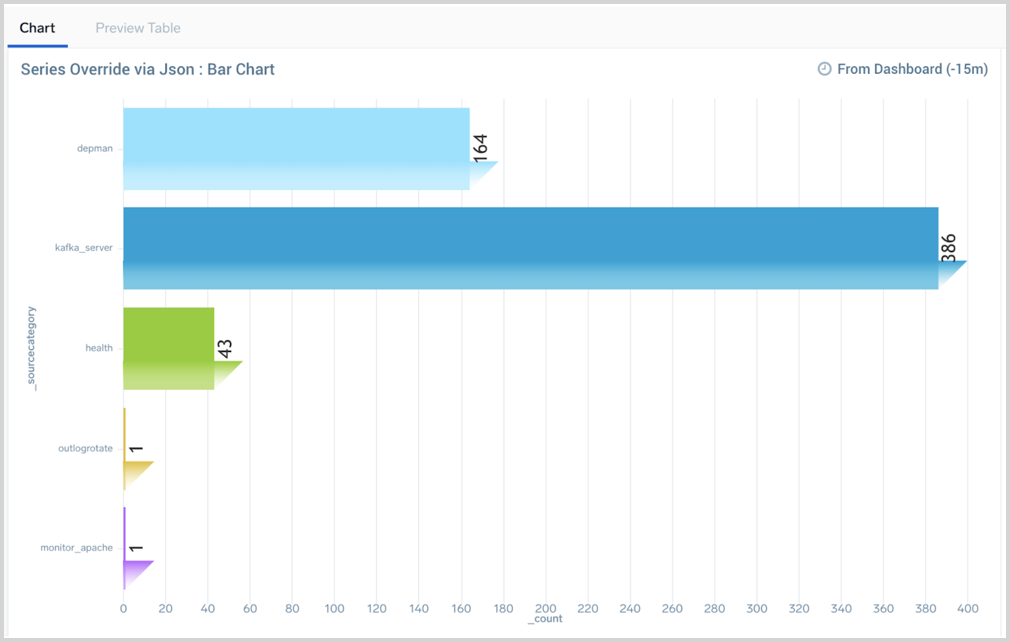
use the following JSON:
"overrides": [
    {
        "series": [],
        "queries": [
            "A"
            ],
        "userProvidedChartType": false,
        "properties": {
            "type": "bar"
            },
        "unsafeCanvasJSProperties": {
            "bevelEnabled": true,
            "indexLabelPlacement": "outside",
            "indexLabel": "{y}",
            "indexLabelOrientation": "vertical"
            }
    }
]
Resize data label font size
To resize the font size of data labels in a pie chart: 
add this line under the general section:
"general": {
...
"indexLabelFontSize": 8
},