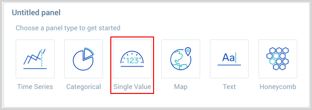
Single Value Charts
You can use single value charts to display results for a search or metric query as a single value, for at-a-glance analysis. This page shows you how to create and tailor single value charts for searches.
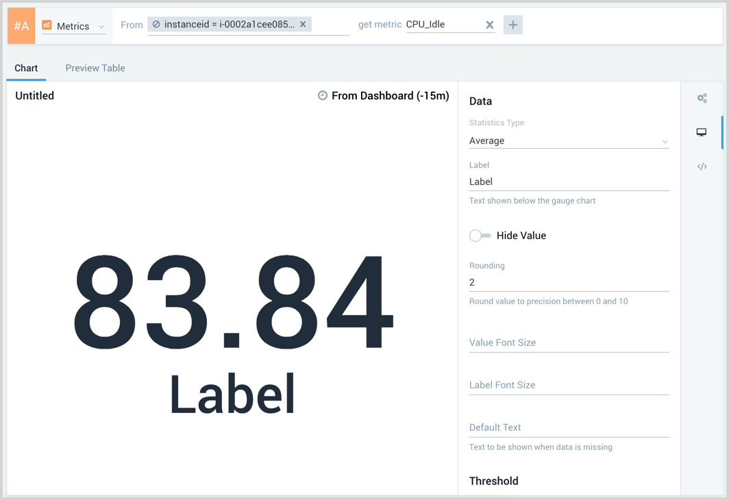
A single value chart displays a single record from a search, in order to make that value stand out at a glance. If the query returns more than one value in the Aggregates tab, only the first value is displayed in the single value chart.
A single value chart is useful for summarizing a time series in a single value. For example, you might want a dashboard panel that shows the number of errors generated by your site over the last 24 hours.
Create a single value chart
To add a panel with a single value chart:
-
Create or open a Dashboard and click on Add Panel > Single Value.
-
Provide a Metrics or Logs query and press Enter for it to run.
Log query:
Enter your aggregate search query in the input field and press enter. Only search results that have been aggregated using a group or aggregate operator can be charted. See Group or Aggregate Operators for a list. By default, the query builder is set to Logs.

Metrics query:
Click the left-most dropdown option and select Metrics. You should be familiar with the basics of creating metrics queries to ensure successful results. By default, the query builder is set to Logs.
To create a metrics query utilize the Metrics Explorer.
-
Modify the chart as desired.
-
Click the Add to Dashboard button on the top right of the window to add the panel to your dashboard.

Boolean
A boolean single value chart displays a value as true or false. For example, the following query checks if more than 100 errors are found.
error | count as MyCount | if (MyCount> 100, true, false) as MyCount
The boolean single value chart would look like the following.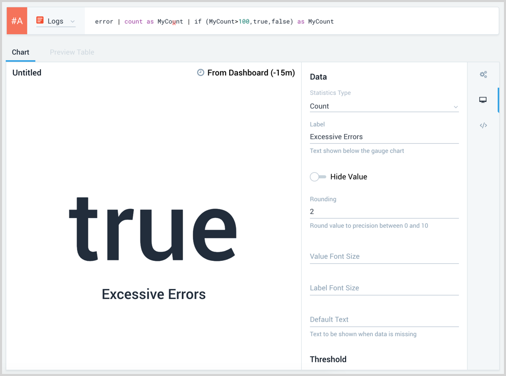
Sparkline
The Sparkline option is available for metrics and logs queries. A log query requires your query to have a timeslice operation and you will need to sort the timeslice as part of the query for the sparkling to render correctly.