Create a Heat Map
A heat map visualizes the count of data points returned by a metrics query within specified value ranges over time intervals of a specified duration. This feature is most useful for queries that return non-aggregate results.
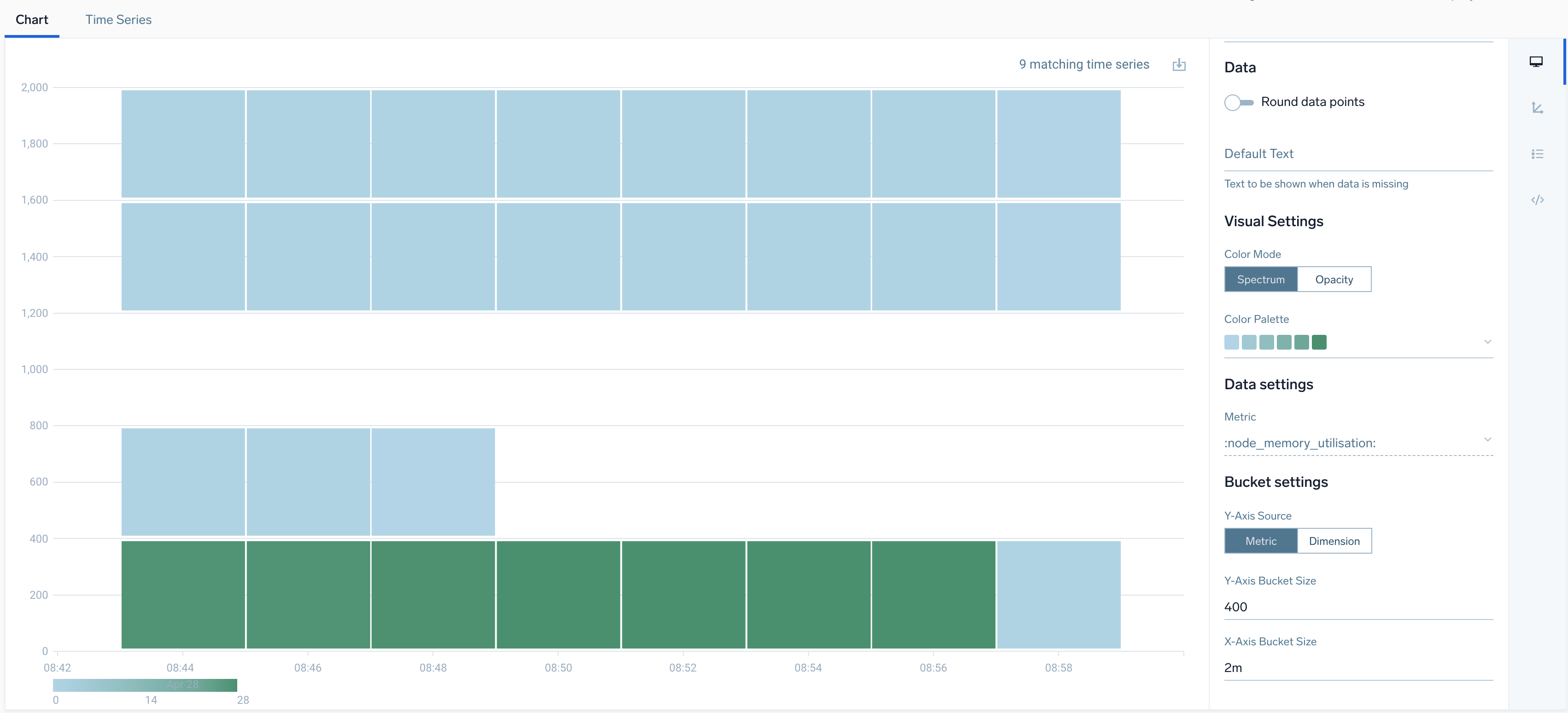
In a heat map, data points are typically aggregated by value on the y-axis and over time on the x-axis by default. You can change y-axis aggregation to dimension based by selecting Dimension in Y-Axis Source property. Sumo Logic automatically calculates values for these settings, based on query results. You can explicitly configure the desired value and time ranges by clicking the fields in the Bucket Settings section of the Chart View UI and entering new values.
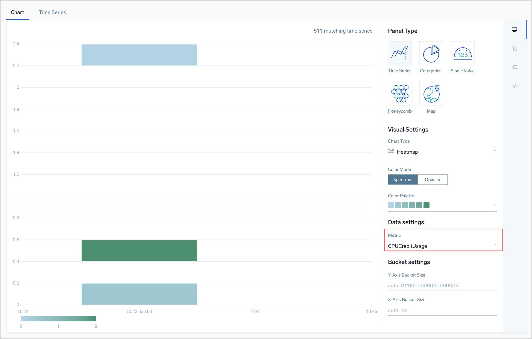
Each rectangle shown on a heap chart corresponds to a set of data points. As noted above, the location of a rectangle within the heat map indicates the time range and value range of its underlying data points. By default, the color of a rectangle indicates the volume of data points in the time range. You can choose from multiple color palettes. The more intense the color within the palette, the more data points it represents. You can hover over a rectangle to see the count of data points and the value range. If desired, you can represent the data point count by varying levels of opacity of a selected color, rather than by intensity across a selected color palette.
To create a heat map
- Enter and run a metrics query.
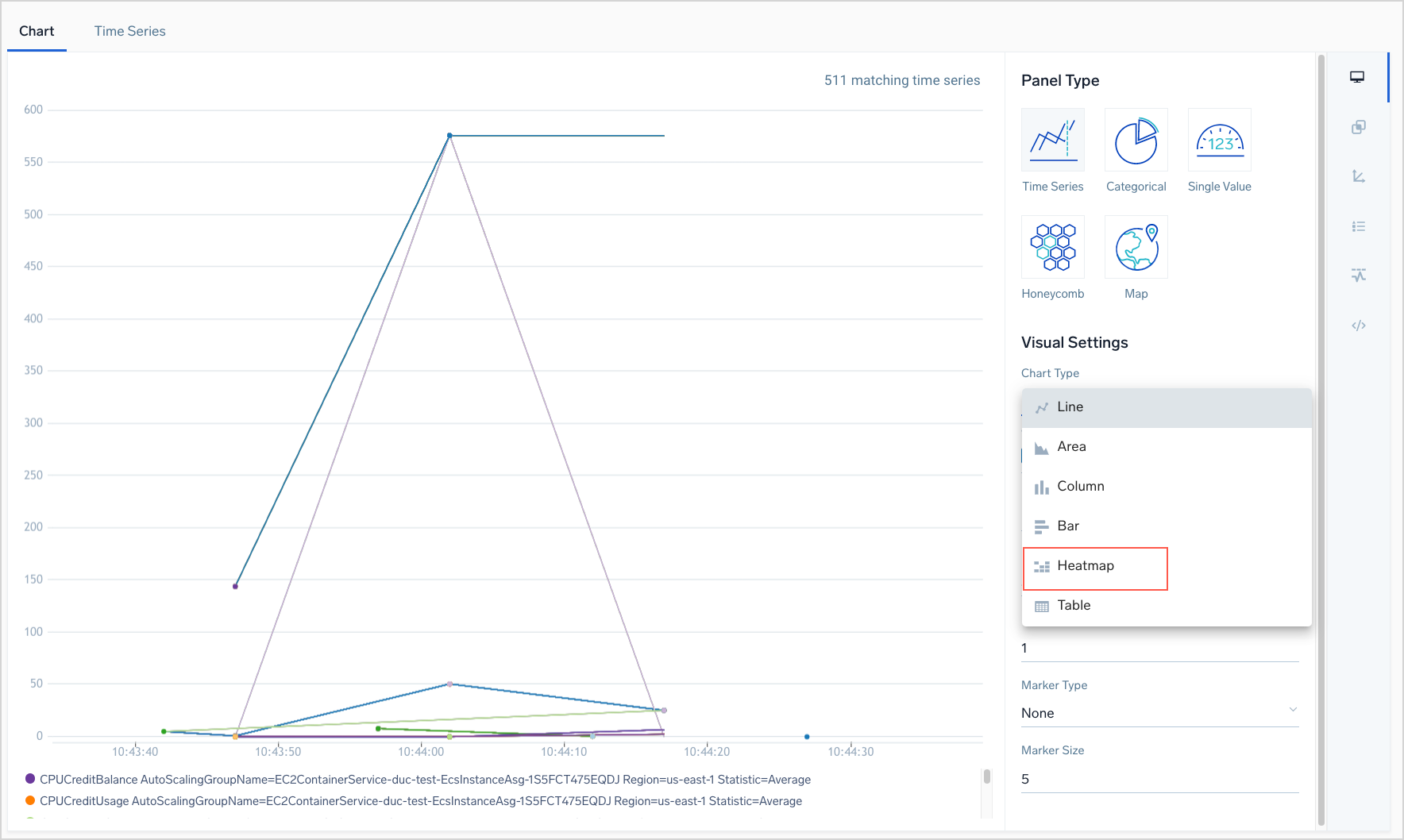
- On the Chart tab, select Heatmap from the Chart Type dropdown.
 1.A heatmap appears, visualizing one of the metrics returned by the query. If the query returns multiple metrics, you can use the Metric dropdown to select a different metric to visualize.