Create a Map Chart
Map Charts
A map chart visualizes metric query results by geographic location.
To use a map chart your query results must include dimensions that provide latitude and longitude. We assume the geolocation dimensions are named latitude and longitude. If the dimensions have different names, you can identify the correct fields in the Chart tab.
Map visualizations are supported in the Metrics Explorer and dashboard panel builder.
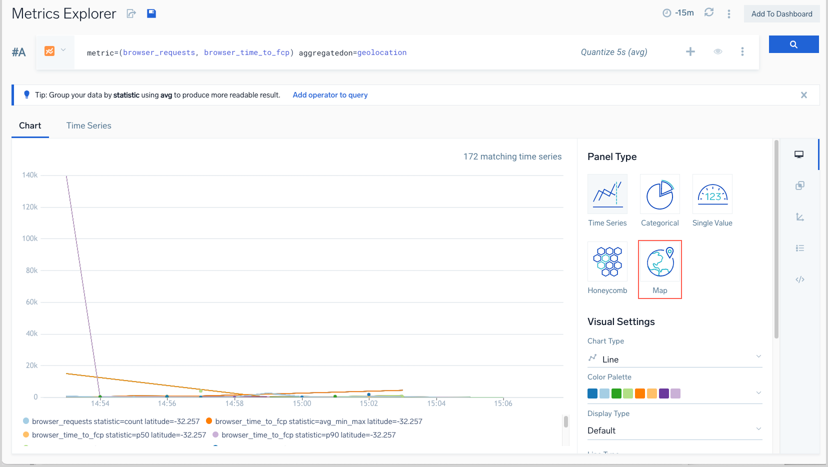
For a Map visualization, you can choose either Cluster or Heatmap as the Chart Type.
Your query can return multiple metrics, but there’s a limit to how many you can visualize.
Create a Map chart
- Enter a metrics query that returns dimensions that provide latitude and longitude. Your query can return multiple metrics, but there’s a limit to how many you can visualize. A cluster chart supports queries that return two metrics. A heat map supports a single metric.
- Open the Chart tab, and select Map as Panel Type.
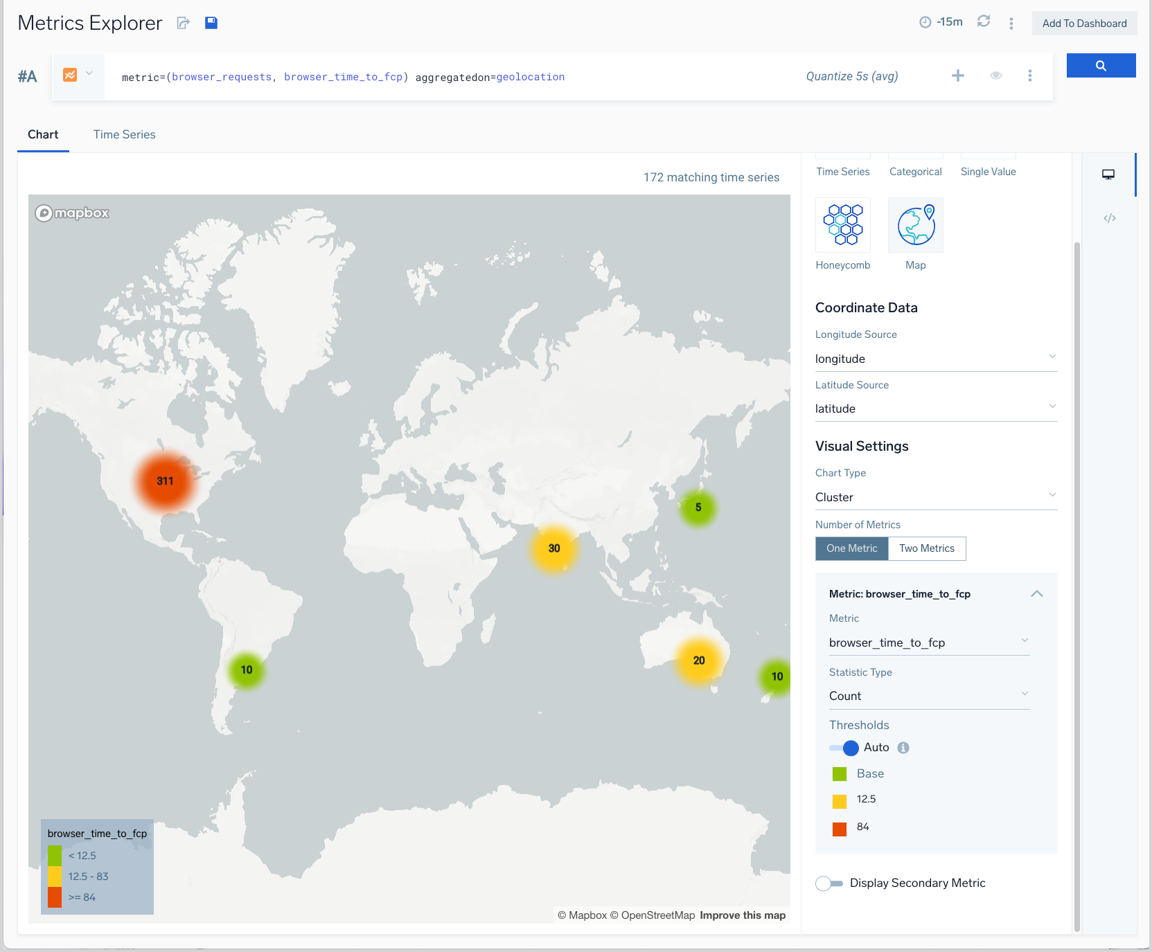
- If your query returns dimensions named latitude and longitude, the chart tab will display a cluster chart on a world map. If the dimensions that contain latitude and longitude are not named latitude and longitude, use the pull-downs in the Coordinate Data area to select the dimensions that contain the coordinates.
Interacting with a Map Chart
By default, the Chart Type for a Map visualization is Cluster, as shown in the screenshot above. In a cluster chart the size of the circle indicates the number of matches. A circle with a sharp edge means the cluster represents a single time series. A circle with a fuzzy edge represents multiple time series. You can tailor a Cluster chart in the following ways.
Number of Metrics
If your metrics query returns two metrics, you can choose between:
- One Metric. A cluster appears anywhere that data for at least one metric was returned.
- Two Metrics. A cluster appears anywhere that data for both metrics was returned.
Display Secondary Metric
If your metrics query returns two metrics, choosing the Display Secondary Metric option will result in both metrics being visualized on the chart. Note that when you choose this option, you can set a different chart type for each of the metrics–one can be cluster and the other a heatmap, as shown in the screenshot below. 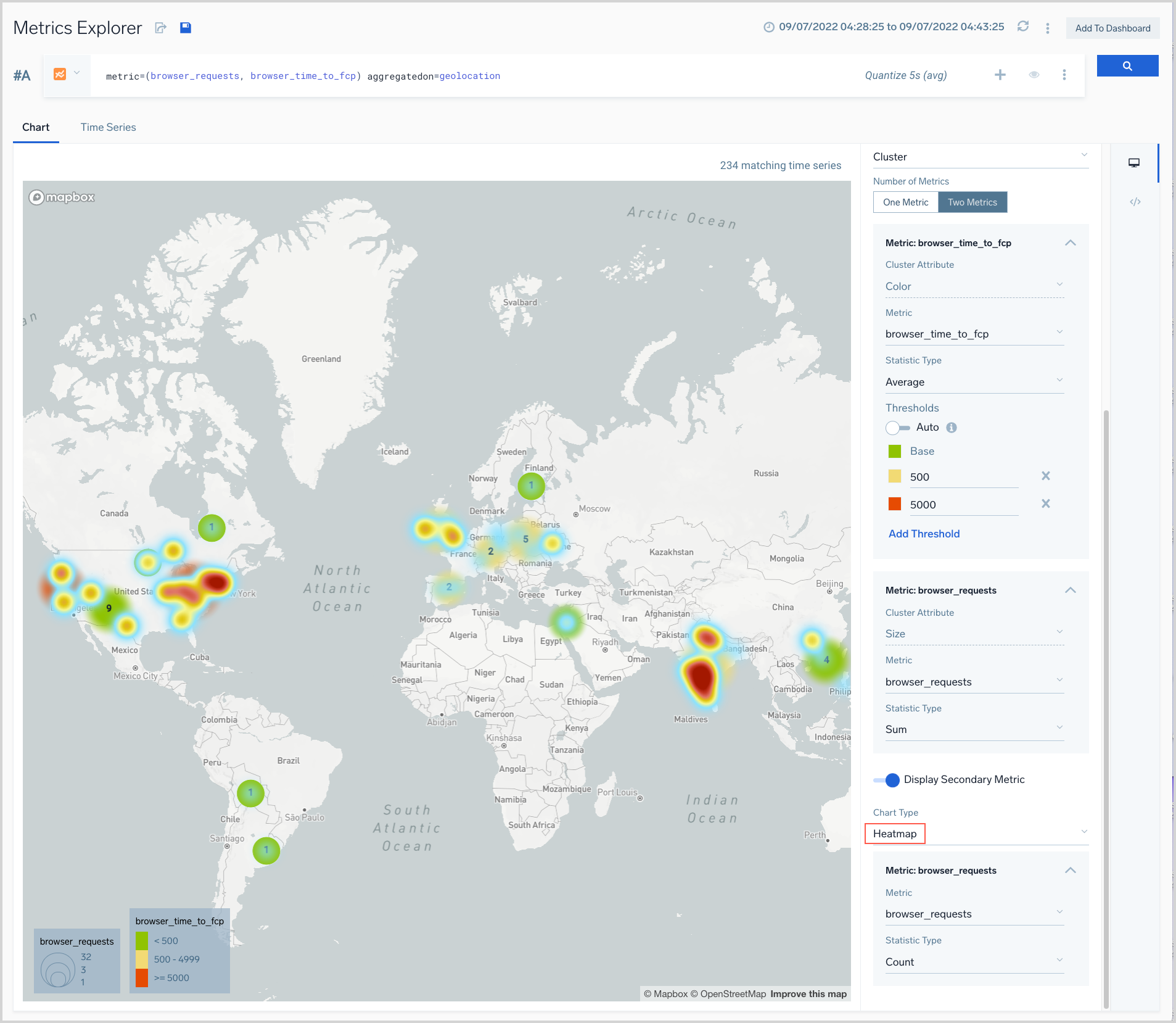
Statistic Type
By default, query results are aggregated by the count function on the chart. You can use the Statistic Type option to select an alternative aggregation function: average, minimum, maximum, sum, or latest.
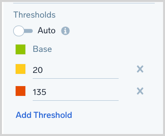
Thresholds
The clusters on a cluster chart are color-coded red, yellow, and green, based on thresholds that we determine based on your query results. If you want to set your own thresholds, add an additional threshold setting, or remove a threshold toggle the Auto option off.